
Ask an epidemiologist: Where to learn online about COVID-19

There’s much confusion about the new disease, but numbers don’t lie. The challenge is finding the right ones to follow.
As the COVID-19 spreads, a tsunami of information has swept across the Internet, making it challenging to understand the scope and severity of the pandemic. We asked 3 epidemiologists at Kaiser Permanente Washington how they are monitoring the situation. Here are their responses to the following question:
What sources are you using to make sense of the COVID-19 pandemic, and as an epidemiologist what sorts of information are you looking for?
 JESSICA CHUBAK, PhD, Senior Investigator
I’ve been interested in what is happening in our region, particularly because Washington State was hit early. The county and state websites – Washington State Coronavirus Response (COVID-19) and Public Health-Seattle & King County Corona Virus Disease 2019 (COVID-19) – provide good local information though there are some lags in the data. Because they weren’t showing how things were changing over time – the trajectory of what was going on – I decided to plot the information they post each day. I now have graphs of confirmed positive cases, negative tests, and deaths regionally. To put the information in a national and global context, I look to Coronavirus (COVID-19) on the U.S. Centers for Disease Control and Prevention website and the Coronavirus COVID-19 Global Cases map on the website of the Centers for Systems Science and Engineering at Johns Hopkins University.
The CDC site has great information on topics ranging from prevention and preparation to caring for sick family members. Their “Frequently Asked Questions” page includes topics like whether you can catch the virus from your pet and what you to do if you’ve been traveling or have travel plans. I trust these sites because reputable agencies and groups are behind them. They work hard to get the information right.
 KAREN WERNLI, PhD, Associate Investigator
Understanding the impact of the virus internationally has been – and continues to be - important to me. At the start of the pandemic, my daughter was studying in Switzerland, where my husband’s family lives, and many of my coworkers have family living around the world. So I have been following the data science work of John Burn-Murdoch of the Financial Times, based in London. These figures present counts of confirmed cases and deaths by nation, and while they do not account for population size, they do help you understand the case load burden and growth in cases over time. I have found the whole numbers to be of interest in determining how the number of cases are directly impacting the nations they represent.
I daily think about friends and colleagues who are frontline health care workers, and I worry about their safety. This concern has led me to learn more about when the U.S. will reach our health care capacity. Developed by the local Institute for Health Metrics and Evaluation, these figures estimate when the U.S. will reach our national capacity. These projections indicate the need for more personal protective equipment, hospital beds, and staffing to keep Americans alive. These charts have now been seen nationally through White House press briefings, as they also estimate the number of deaths anticipated in the US and by state. The current models, as of April 1, are projecting greater than 93,000 deaths of Americans.
 ERIN BOWLES, MPH, Senior Research Associate
I’ve been following both local and national sites for information on testing, positive cases, and deaths. My favorite local site is the King County COVID 19 Data Dashboard, which has a neat interactive interface that allows the user to look at positive test rates by zip code or city – so you can really nail down what’s going on in your neighborhood. The website also shows data on test results over time and by sex and age group. The other local website I follow is the University of Washington Virology COVID-19 Dashboard. It’s not as detailed as the King County dashboard, but it shows testing and positive case numbers over time – and it includes a broader sample than King County alone.
For national data, I like the CDC’s website – particularly their page on testing in the U.S. The most recent week of data is incomplete, but it is encouraging to see the overall testing numbers increase, which is critical to overcoming this thing. I also like the Institute for Disease Modeling InfoHub, which has a variety of COVID-19 research and reports posted, and interactive maps of confirmed cases and deaths all over the world. Like many others, I also use social media to keep up to date. I follow many infectious disease epidemiologists and virology researchers on Twitter, such as Trevor Bedford and Angela Rasmussen. They’re both included in a great list of Coronavirus Experts, put together by epidemiologist Ellie Murray.
A word of caution about all these sources – it’s easy to get overwhelmed by the volume and severity of information. I highly recommend taking breaks from the media. I took a break this past weekend knowing that the world was still going to be the same on Monday morning – and my mental health was greatly improved because of it!
research
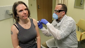
Kaiser Permanente launches first coronavirus vaccine trial
On March 16, 4 volunteers received an injection of an mRNA vaccine for COVID-19 in an NIH-funded trial in Seattle.
research
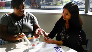
Prepping to fight the next flu pandemic
A KPWHRI pilot study shows that a self-swab test may help individual patients and whole populations.